Sunday, 6 May 2018

WEEK 11

CONTACT SHEETS:

From my final photoshoot I created a contact sheet in Photoshop so I could look over all the photos I had taken. This allowed me to see which ones were better than others, which is where I have put crosses on the top right corner. I did this if they were out of focus or too exposed. Also because I kept on taking them, the models had closed eyes in some of them.
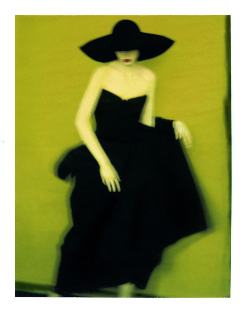


EDITING IMAGE 1:

As I was going through the photos I found this one and I really liked it because I think the composition works really well with the concept. My project is about individuality and being your own person, by using a low angle I think that it shows domination and goes well with the bold colours.

To start editing I fixed up the brightness and contrast as the original photo was a little over exposed. Then did the contrast to make everything stand out more than it normally did. I next worked with the blur tool and blurred the negative space under arms and around the edges. This made the main subject stand out even more. As I have previously mentioned, I really like the look of a film camera effect and have tried it out before on my test photos. Therefore, I added a small amount of noise and scratches to the final edit.

Original photo:


Final edit: 

EDITING IMAGE 2:

Editing photo two, I went through the same processes as the first photo as they were in the same location and lighting. Firstly, contrast and brightness because of the slight over exposure. Then adjusted the curves to bring out the colour even more and make the edges more visible. Lastly adding the minimal amount of noise to create a vintage/film look. 

Original photo:


Final edit:

EDITING IMAGE 3:

Continuing the editing, I took my third image and cropped it straight away. I played with the brightness and contrast to level it out as the shadows are very dark with contrasts the brightness in the photo. You can see that the sun is quite strong so I toned it down a little bit to make the photo easier to look at. Then I used the vibrance tool to lower the colours as they looked quite luminous in the photograph. I do want the colours to be bold, but not extremely bold that it takes away the focus of the main subject. Then layered a few surfaces of noise to make the photo look older. I think this one came out quite well and looks like a 90s inspired image.  

Original photo:


Final edit:

EDITING IMAGE 4:


To edit the fourth image I started of by using the sharpen tool but only on certain parts of the denim jacket to make it stand out and look more 3D. After this I went onto the brightness and contrast to decrease the shine of sun on her face and level out the foreground with the background. Then finally, I added two layers of noise on 3.5%. 

Original photo: 


Final edit:

EDITING PHOTO 5:


When editing photo 5 I wanted to continue the steps I went through with the others so they all have a similar looks as they all follow the same concept and narrative. But, this photo was at a different angle and had darker lighting with lots of shades. Firstly I edited the vibrance and increased that by 53 as the shade hid the colour of blue on the wall. Then, I went on to increase the brightness quite a lot, again, due to the shade. As I had turned the vibrance up a lot the contrast wasn't too important as it made the photo look too deep. Lastly, I went on to the filter tab at the top and added noise by 3%. This was perfect amount I found as too much made it look like there was a sheet over the top of the photo making it look dirty.

Original photo:


Final edit:

EDITING IMAGE 6:

Last but not least, the final photo was fairly straight forward to edit as it was the same location and camera settings as the others, therefore nothing major was changed. I played around with the brightness to start of with, because I used natural light throughout the whole shoot it was unpredictable where the sun was going to shine through to so the contrast and brightness is a different level on all of the photos. As the model is quite far in front of the wall its quite difficult to see the colour, therefore I used the channel mixer and increased the blue slightly to bring out the colour more. Then as usual, I finally added noise to finish the edit on the number 2, then again on 2 so there were 2 layers. 

Original photo:


Final edit:

WEEK 10

FINAL PHOTOSHOOT:


For my final photoshoot I went into Brighton and went to the locations I had scouted previously. I had also got a few models down with me to be in the photos.

Prior to this, I had wanted to use the colours blue and yellow to match the graffiti walls, so came up with two different outfits that matched these. One of my models had a striped yellow jumpsuit which worked perfectly for the style I was going for, and then I got my other model to wear double denim to match the blue wall. I feel that I represented individuality quite well here as both outfits give a slight vintage feel.

Pictures below of models outfits:


I decided that the flashgun wasn't necessary for this shoot, although I had it with me, as it was a bright and sunny day the flashgun would have been too much and I did prefer the natural light. Below are some photos of me taking the photographs for my project:


Wednesday, 25 April 2018

WEEK 9

READING:

Culture of Connectivity - Jose Van Dijck
  • Dijck starts to introduce what kind of platform Flickr is by explaining its uses and statistics. Then follows by taking apart its motto ‘Share your photos. Watch the world’. Firstly, '
  •  exchanging views to achieve an agreed upon viewpoint', secondly, 'sharing pictures leads to a collective experience.' and thirdly, 'Flickr functions as collective memory'.
  • 'collective memory has become problematic in the age of digital networks (Hoskins, 2009).'
  • The 'technological unconscious' - We are aware of what lies on the surface of social media platforms and the basic uses of them but have no idea what goes on behind the scenes, 'What David Beer (2009) calls the ‘power of the algorithm’ could be considered the core of the technological unconscious.'
  • The 'continuous present' - 'any memorizing activity takes place in the current flow of contacts between people and machines and cannot be the result of either an individual or collective reminiscence.'
  • 'Culture of connectivity' - Dijck expands on Hoskin's concept by showing how 'the notion of connectivity has become to our understanding of culture.'
Susan Sontag - On photography
  • 'To photograph is to appropriate the thing photographed. It means putting oneself into a certain relation to the world that feels like knowledge -- and, therefore, like power.'
  • This was a very interesting reading and I did really like it because of its simplicity. Sontag gives examples from history but also relates photography to today's society. 

SARAH MOON:

'Sarah Moon, previously known as Marielle Warin, is a French photographer. Initially a model, she turned to fashion photography in the 1970s. Since 1985, she has concentrated on gallery and film work.' (https://en.wikipedia.org/wiki/Sarah_Moon)

- Fashion photography and colour inspiration : 
Image result for sarah moon photography

PROJECT DEVELOPMENT:

Location scouting:

1) Blue background - Tichborne St, Brighton


Sunday, 15 April 2018

WEEK 8

SHOOT 2 :

Here are the photos from my second photo shoot. I am still in the testing process so these aren't perfect and I still have things to improve on. For example the composition in a lot of them is quite off and as it's against as brick wall it can be quite obvious. This is something I can fix in Photoshop though. Another thing is the focus, which I did manually but as it was quite bright it was hard for me to see if it was in focus or not.

I also think the problem that occurred here was that the photos were taken of my close friends, which made it difficult to take serious photos of them and they weren't really concentrating. 


I tried to get something out of these photos and edited some by manipulating the backgrounds:


LAURA STEVENS:

Laura Stevens created a series about the stages of a heartbreak and came out with some touching photographs which show 'loss and renewal'. I think these are incredible ways of portraying emotions and personal feelings. I also like how she uses colour as a subtle theme throughout this series which brings life into them. 

The way she uses the models as the main subject is more of what I think I should be doing in my work for this project. She poses them in a way that tells a story and I think to portray personality and individuality I need to get my models to be more of themselves in the shoot. The first shoot I did worked well because I had my friend behind the camera talking to the model which put her at ease (and the fact she modelled when she was younger helped a lot too!). 


READING:


ANALOG TO DIGITAL: THE INDEXICAL FUNCTION OF PHOTOGRAPHIC IMAGES -
  • Marshall McLuhan, philosopher, 'the medium is the message', talking about media such as print, photographs and telephones. "for the 'message' of any medium or technology is the change of scale or pace or pattern that it introduces into human affairs." 
  • Digital technology is easier for editing because its all now essentially just data changing. Editing process of film however, is scanning , printing and displaying.
  • 'just because a photograph is created or distributed with digital technology does not negate its indexical function as many theorists have suggested. Focusing only on the theoretical lack of indexicality in digital images ignores the social uses of analog photography that are now performed by digital images.' 
  • Overall, I really liked the reading as it gave a wide, detailed insight into the difference between analog and digital photography. I personally do prefer the authentic feel to film cameras and having the photos unedited through Photoshop on the computer but I also agree that you can get a interesting look to digitally edited photographs. The way coding works really intrigues me and is fascinating process and unlike another ways can make a photograph one in a million.

WEB GALLERY

Can be found at: https://maddietodxo.wixsite.com/website/photography